Reading-notes
React Docs - Forms
What is a ‘Controlled Component’?
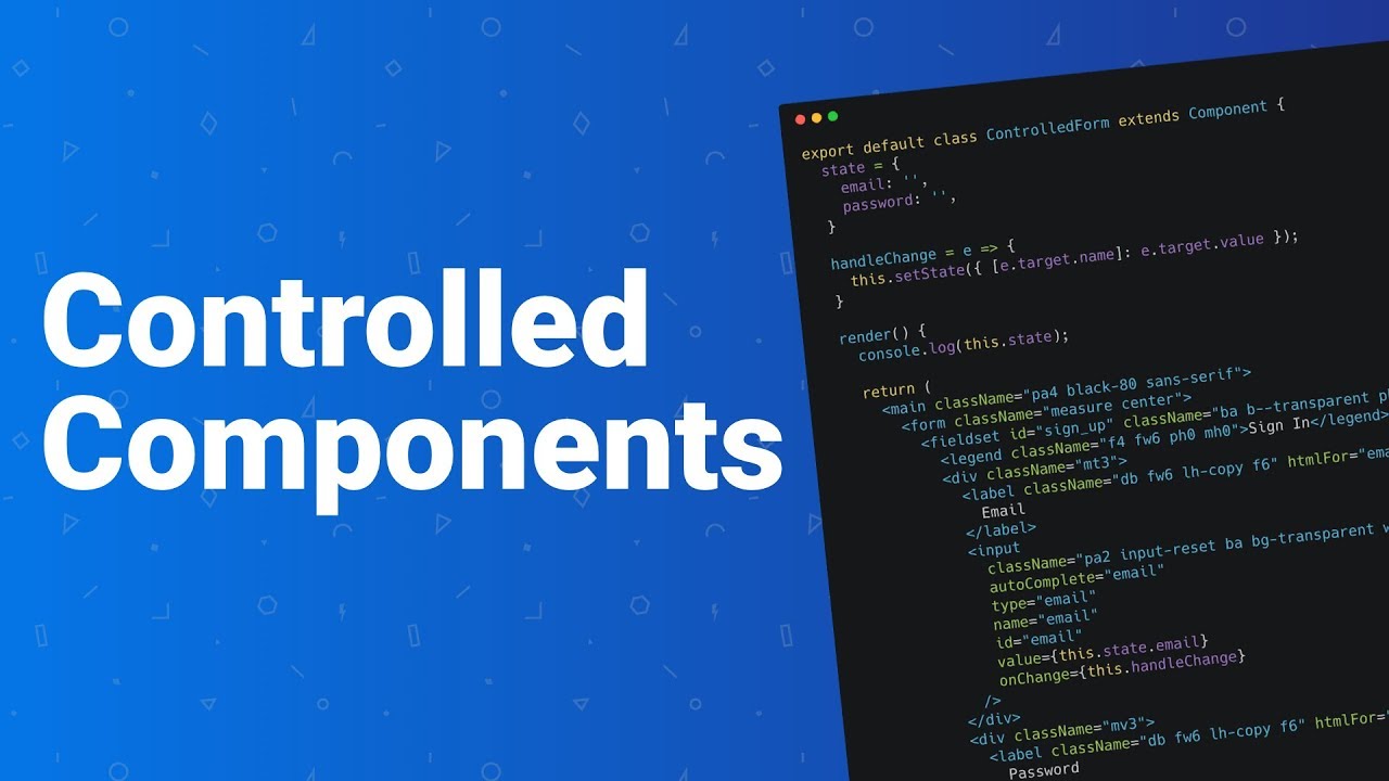
A controlled component is a component that renders form elements and controls them by keeping the form data in the component’s state.
Should we wait to store the users responses from the form into state when they submit the form OR should we update the state with their responses as soon as they enter them? Why.
The second:update the state whil with users responses ..we have to read the value from the input element whenever we want it. This means we can’t provide instant validation on the field as the user types, nor can we do things like enforce a custom input format, conditionally show or hide form elements, or disable/enable the submit button. Fortunately, there’s a more sophisticated way to handle inputs in React.
An input is said to be “controlled” when React is responsible for maintaining and setting its state. The state is kept in sync with the input’s value, meaning that changing the input will update the state, and updating the state will change the input. and for some reson :
-
instant input validation: we can give the user instant feedback without having to wait for them to submit the form (e.g. if their password is not complex enough).
- instant input formatting: we can add proper separators to currency inputs, or grouping to phone numbers on the fly
-
conditionally disable form submission: we can enable the submit button after certain criteria are met (e.g. the user consented to the terms and conditions)
- dynamically generate new inputs: we can add additional inputs to a form based on the user’s previous input (e.g. adding details of additional people on a hotel booking)
How do we target what the user is entering if we have an event handler on an input field?
-
The event also applies to elements with contenteditable enabled, and to any element when designMode is turned on. In the case of contenteditable and designMode, the event target is the editing host. If these properties apply to multiple elements, the editing host is the nearest ancestor element whose parent isn’t editable.
-
For elements with type=checkbox or type=radio, the input event should fire whenever a user toggles the control, per the HTML5 specification. However, historically this has not always been the case. Check compatibility, or use the change event instead for elements of these types.
The Conditional (Ternary) Operator Explained:

Why would we use a ternary operator?
Shorten your if statements into one line of code with the conditional operator , most clear and more simplefy with out making problem .
Rewrite the following statement using a ternary statement:
x=y ? console.log(true) : console.log(false);